This post will display different types of typography that I find particularly interesting. This was a homework task meant to help myself and my classmates understand what makes effective and interesting typography; in preparation for creating our own identities and logos to represent ourselves.
Game Logo with three-dimensional details/text

Source: Super Mario Logo
The logo for the game Super Mario Galaxy is a very simple case of adding implied meaning with colours and images to text. The Mario part is filled in with different block colours in a way that is instantly recognisable as it is the same as, if not similar to, the older logos that have been used since the franchise’s birth. The new gimmick with this logo is that there is a literal galaxy in the word Galaxy which makes it clear to the person looking at it that this game has a lot to do with things in space.
Kinetic typography
This work-in-progress lyric video shines through with how it manipulates text, changes perspective by moving the camera, and uses simple line art to give more meaning and movement to the lyrics. The lines, “Have you got color in your cheeks?” and, “Do you ever get that fear that you can’t shift” have mostly had edits to the colour and style of their text; with the word “color” having a simple animation of colours flashing through to put emphasis on that word, and the word “fear” has a crumbling and broken appearance that is reflective of how most people hold themselves when they are afraid.
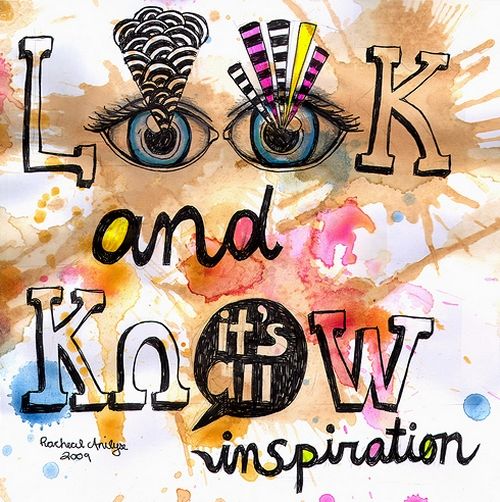
Hand generated typography design

Source: Look and Know
This piece is loud, colourful, and perhaps messy to give a striking image with an inspirational message. The artist has taken every opportunity to make this piece attract attention; from the splatters of colour, semi-stylised eyes in place of two letters, and font change – everything was made to be noticed and seen.
3D Motion Typography

Source: The Alphabet is your Playground
The Alphabet is your Playground is very quirky and unique in how it gives every letter similar patterns of movement while having individual characteristics. Each letter is very bright with dynamic shapes, textures, and kinetic effects.
2D Motion Typography
The opening credits for The Pink Panther are really intersting in their simplicty and implementation; using the actual typed words to interact with the animated characters. Throughout the credits, Pink Panther – while trying to avoid Big Nose (is that his name? I can’t remember…) – uses a name as an old plane propeller, rubs up against another name like the cat he is, repairs the title card by moving a part of the word “panther”, vandalises the credits, sneaks into the credits when he isn’t supposed to, and jumbles up a name before being forced to rearrange it. This adds humerous imagery and lets us know that Pink is a very mischievious character because if that is how he treats the credits how would he behave in the film?
Poster Using Typographic Design

Source: MV Graphics – typography work
This poster created by MV Graphics is a classic example of making a shape and/or object by making a silhouette with words related to the shape/object. This is filled with words that can be used to describe coffee (Rich, Smooth, Delicious, Creamy) and the atmosphere typical of a regular Starbucks. The words are coloured depending on where they have been used on the coffee cup.
TV Show/Movie Intro
Video Game High School’s intro for season one shows off the fact it has video games involved by starting with a small game of PONG which then transitions and transforms into a storming flow of pixel-like cubes to form the school’s emblem. The camera always changes to focus on new words/symbols being formed by the cubes before the final slow pan-out to reveal the final logo.
Typographic Artist – Gail Anderson

Source: Typography 22
Gail Anderson has created some interesting ways to add a great style to the book Typography 22. All of these graphics fit specific styles and themes that work well when given a final design.